FinTech App for Global Money Transfers

An intuitive mobile-first financial application for secure and efficient domestic and international transactions, later adapting it for desktop while ensuring a seamless user experience across platforms.

Role

Senior UX/UI Designer

Industry

FinTech

Duration

3 months

a cell phone on a bench

Stage 1. Usability Audit

Before diving into the design phase, I conducted a usability audit to identify pain points in existing financial transaction apps and ensure an optimized user experience. This process helped uncover usability issues, improve efficiency, and establish a strong foundation for the new design.


Research Approach

I analysed competitor apps and user feedback to identify common friction points in digital money transfers. The audit focused on:

Navigation & Flow Efficiency: How easily users complete transactions.

Clarity & Transparency: Visibility of fees, exchange rates, and transaction details.

Error Handling & Security: How well apps prevent and guide users through errors.

Mobile vs. Desktop Usability: Differences in user behaviour and expectations across devices.


Key Findings:

Complex Onboarding: Some apps had long and tedious signup processes, leading to drop-offs.

Confusing Transaction Status: Users struggled to track payment progress and history.

Hidden Fees & Exchange Rates: A lack of upfront cost transparency led to user frustration.

Inefficient Recipient Management: Adding and managing recipients required too many steps.

Security Concerns: Some apps failed to provide reassuring security indicators.


Actionable Insights:

Based on these findings, I set design goals to enhance usability:

• Simplify onboarding with a step-by-step guided flow.

• Improve transaction tracking with clear status indicators and real-time updates.

• Display all fees and exchange rates upfront to build user trust.

• Streamline recipient management with saved contacts and quick actions.

• Reinforce security with clear UI elements like biometric authentication and verification steps.


Stage 2. Design Strategy

With insights from the usability audit, I crafted a design strategy focused on simplicity, transparency, and efficiency to enhance the user experience for both domestic and international transactions. The goal was to create an intuitive, secure, and visually cohesive platform across mobile and desktop.

1. Design Principles

To guide the design process, I established the following core principles:

User-Centric Navigation: Ensure quick access to key actions like sending, requesting, and tracking payments.

Transparency & Trust: Clearly display fees, exchange rates, and transaction statuses to build confidence.

Efficiency & Speed: Minimise steps and cognitive load, allowing users to complete transactions in seconds.

Security & Assurance: Integrate intuitive security features like biometric login, OTP verification, and fraud prevention indicators.

Consistency Across Devices: Maintain a seamless experience between mobile and desktop versions while optimising for different screen sizes.


2. Wireframing & Information Architecture

To structure the app effectively, I developed a user flow that prioritised key tasks:

1. Home Dashboard: Quick access to balances, recent transactions, and shortcuts for sending/requesting money.

2. Send Money Flow: A streamlined process with saved recipients, real-time fee calculations, and instant confirmations.

3. Request Money Flow: A simple method to request payments with clear tracking and reminders.

4. Transaction History: A categorised and filterable view of past payments for easy reference.

5. Recipient Management: A dedicated section to add, edit, and organise contacts effortlessly.


3. Mobile-First Approach

Since financial transactions are often conducted on the go, I designed for mobile first, focusing on touch-friendly interactions, clear CTAs, and a minimalistic UI. Once validated, I expanded the design to desktop, enhancing usability with additional screen space for detailed financial insights.


4. Visual & Interaction Design

Colour & Typography: A professional yet approachable colour palette with clear visual hierarchy.

Iconography & Micro-interactions: Subtle animations and icons to enhance usability without overwhelming the user.

Accessibility Considerations: High-contrast text, voice support, and keyboard navigation for inclusivity.


Stage 3. Prototype Development

  • Wire-framing: I began the prototyping phase by creating low-fidelity wireframes to establish the app’s structure and user flows. These wireframes focused on core interactions, such as sending and requesting money, viewing transaction history, and managing recipients. By keeping the designs minimal, I was able to iterate quickly based on early feedback, ensuring an intuitive and efficient layout before refining the visual details.

  • High-Fidelity Prototyping: Once the wireframes were validated, I developed high-fidelity prototypes using Figma. These interactive prototypes incorporated real-world scenarios, enabling stakeholders to experience the complete transaction flow. I focused on seamless navigation, micro-interactions, and responsiveness across mobile and desktop. Usability testing with these prototypes helped refine elements like button placements, error states, and confirmation dialogs, ensuring a frictionless user experience.

  • User Interface Design: With usability validated, I applied the final UI design, balancing aesthetics with functionality. I used a modern, trustworthy colour palette, legible typography, and clear visual hierarchy to enhance readability and accessibility. Consistent iconography and subtle animations added clarity, while security indicators reassured users throughout the transaction process. The final design provided a polished, intuitive experience that met both user expectations and business objectives.

a cell phone on a bench
a cell phone on a ledge

Stage 4. User Feedback & Refinement

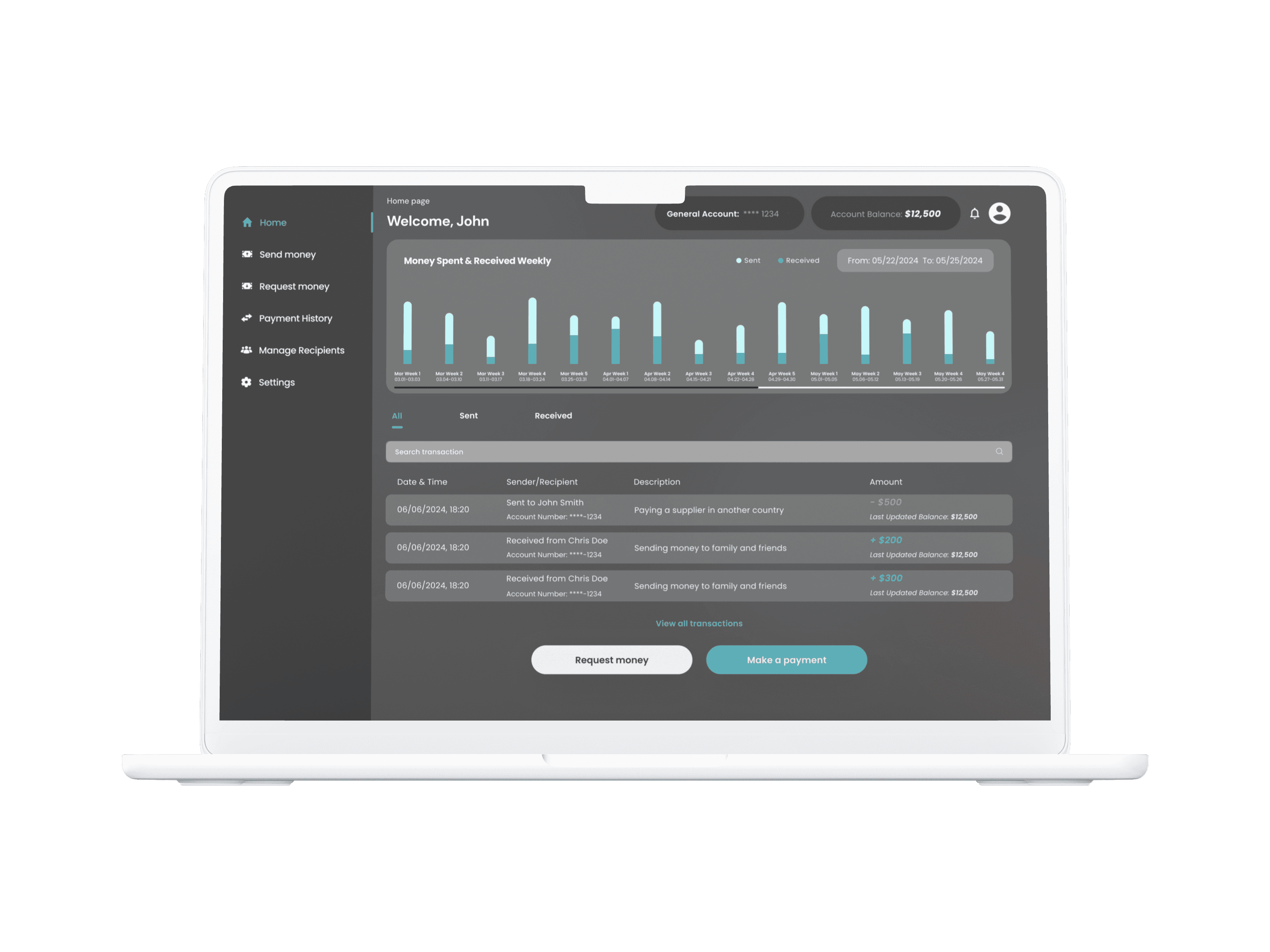
  • User Testing & Feedback Collection

    To validate the prototype, I conducted usability testing with real users, focusing on key transaction flows such as sending and requesting money. Participants provided feedback on navigation clarity, transaction speed, and overall ease of use. I also gathered insights on pain points, such as confusion around fee transparency and recipient management.


  • Key Refinements


    Based on user feedback, I made several refinements to improve the experience:

    Enhanced Fee Visibility: Clearly displayed fees and exchange rates upfront to eliminate uncertainty.

    Streamlined Recipient Management: Introduced auto-suggestions and a simpler interface for adding and managing contacts.

    Optimised Mobile Interactions: Adjusted button placements and touch targets for smoother one-handed use.

    Improved Transaction Status Updates: Added real-time tracking indicators to reduce user anxiety.


  • Final Iterations & Testing


    After implementing refinements, I conducted another round of testing to ensure improvements addressed user concerns. The final design resulted in a faster, clearer, and more intuitive transaction experience, meeting both user needs and business goals.


Stage 5. Implementation & Launch Support

  • Collaboration with Development Team


    During the implementation phase, I closely collaborated with the development team to ensure the design was faithfully translated into the final product. I provided detailed design specifications, assets, and responsive guidelines for both mobile and desktop platforms. Regular check-ins and feedback loops with developers helped to address any technical challenges while ensuring that the user experience remained consistent across different devices.


  • Quality Assurance & Testing


    I participated in quality assurance (QA) testing to identify and resolve any discrepancies between the design and the implemented product. This involved checking for UI consistency, performance issues, and ensuring all interactive elements functioned as intended. Additionally, I reviewed edge cases such as international transactions, cross-device compatibility, and network delays to ensure smooth user interactions in all scenarios.


  • Launch Support & Monitoring


    As the app was launched, I provided ongoing support to monitor user engagement and address any emerging issues. I tracked key metrics such as transaction completion times, error rates, and user feedback to quickly identify areas for improvement. I also helped the team respond to user-reported bugs and implemented minor design tweaks as needed to optimize the experience further.


a cell phone leaning on a ledge
a black cellphone with a white letter on it
a cell phone on a table

Outcomes

The final product successfully met the initial design goals of creating an intuitive, secure, and efficient platform for both domestic and international transactions. Following the launch, the app received positive feedback from users, particularly praising its ease of use, clear transaction flow, and transparent fee structure. Key outcomes include:

Increased User Engagement: After launch, the app saw a significant increase in daily active users, with users reporting that the seamless experience across mobile and desktop made it easier to manage their finances on the go.

Improved Transaction Completion Rate: Streamlined processes, such as simplified recipient management and transparent fee displays, led to a notable reduction in abandoned transactions and improved conversion rates.

Positive User Sentiment: The design’s emphasis on security, with features like real-time status updates and visible security indicators, helped build trust, leading to increased user retention and satisfaction.

In addition to user success, the app met business objectives by boosting customer retention, driving more transactions, and increasing brand trust. Moving forward, the product team continues to collect user feedback for future iterations and improvements based on evolving user needs and feedback.

Other projects

a cell phone on a bench

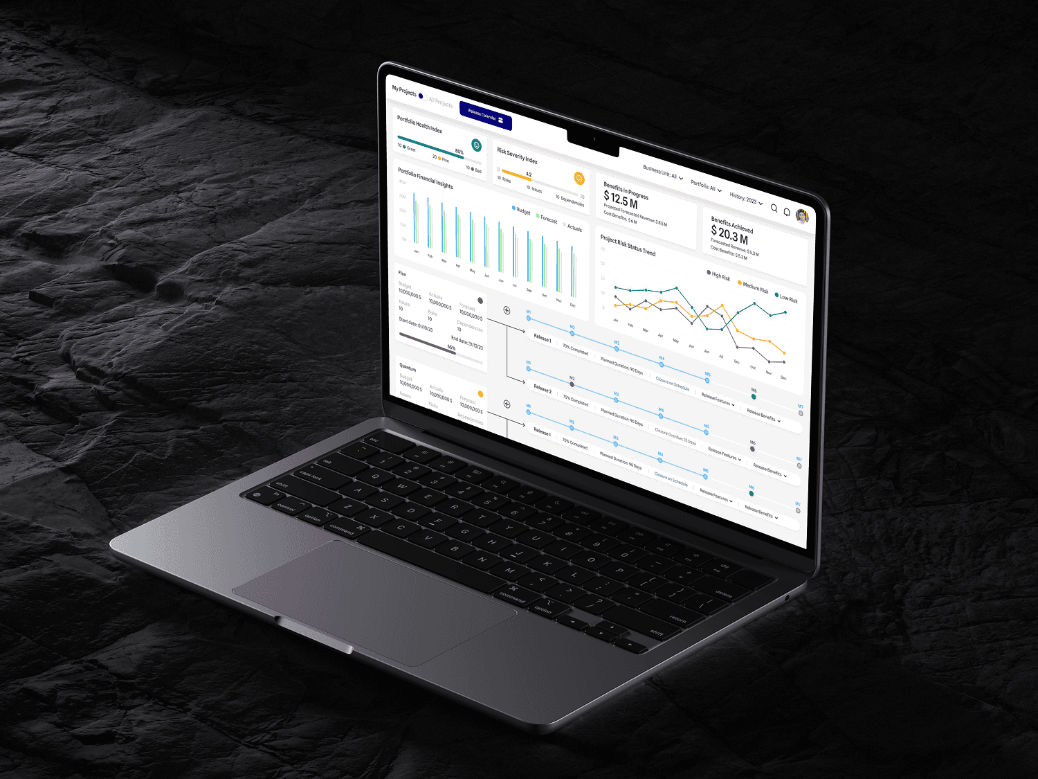
Accessible Delivery Management Tool

Сomprehensive, accessible delivery management tool with intuitive project tracking, financial insights, and real-time risk monitoring, tailored for senior leaders to efficiently manage and oversee company-wide and personal project portfolios.

a cell phone on a bench

Chuttle – A Spontaneous Social & Dating Experience

A dynamic social networking and dating app designed to break the ice through randomly shared photos and videos, connecting people organically—just like real-life encounters.

a cellphone leaning against a wall

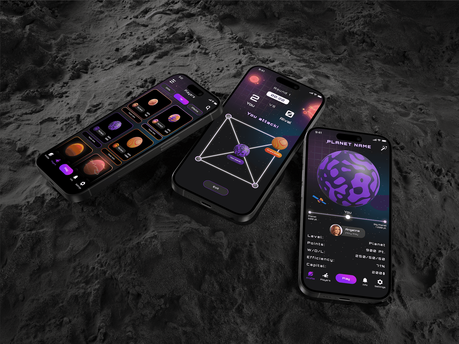
Planets – A Competitive Mobile Board Game

A PvP mobile game where players evolve and customise their planets by competing in strategic board-based battles against friends, AI, or real opponents online.

a cell phone on a bench

AI-Powered Recruitment Portal

A web portal designed to enhance recruiter efficiency with AI-driven features, including automated candidate screening, interview scheduling, talent tracking, and intelligent job matching.

a cell phone on a bench

Seamless Payroll & Transactions App

A mobile app that helps UAE business owners manage domestic and international transactions, including automated salary payments, while ensuring compliance with local financial regulations.

a cell phone on a bench

FinTech App for Global Money Transfers

An intuitive mobile-first financial application for secure and efficient domestic and international transactions, later adapting it for desktop while ensuring a seamless user experience across platforms.

a cell phone on a bench

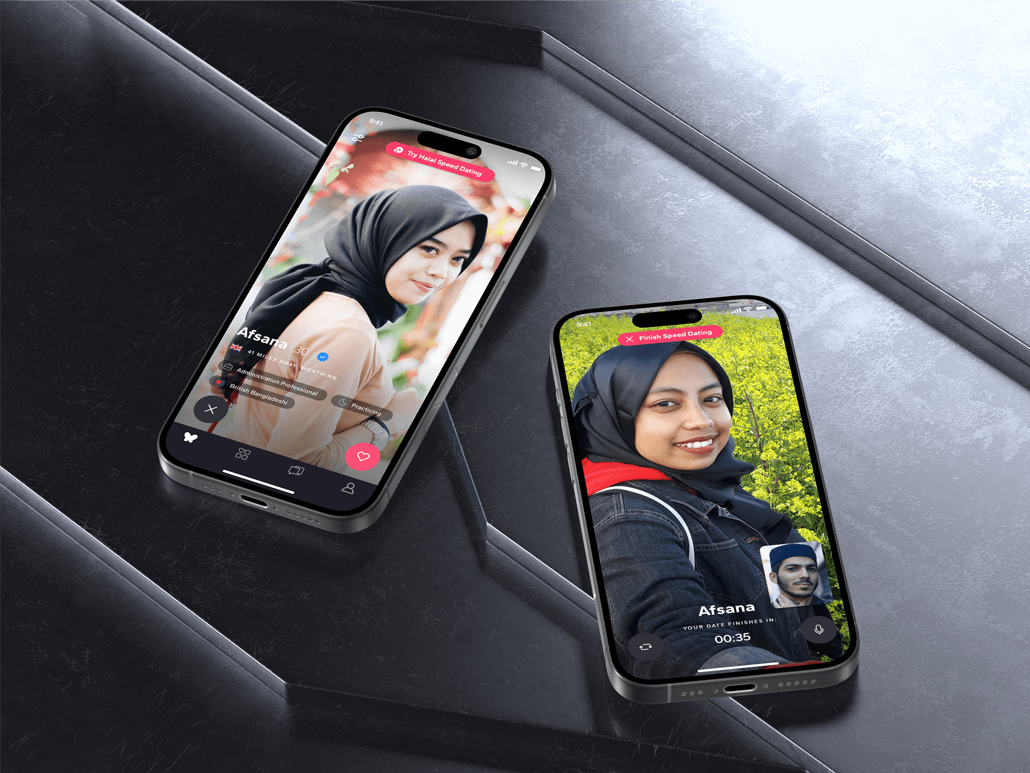
Muzz - Speed Dating Feature

Design for a fast-paced speed dating feature for Muzz, enhancing user engagement and fostering meaningful connections while ensuring a seamless, culturally sensitive experience.

a cellphone leaning against a wall

Atekla - Crafting Strategy and Design for a Web Agency

As a co-founder and creative director at Atekla, I led the strategy, designed the agency’s website, and oversaw web development and branding projects, while managing client relationships and stakeholders.

Copyright 2025 by Aleksandrs Resetnikovs

Copyright 2025 by Aleksandrs Resetnikovs

Copyright 2025 by Aleksandrs Resetnikovs